Yay! It is friday again. Check out this fun sketch designed by Nanne at SOUS. I love this sketch and had fun making a layout using it. Hope you will join us.
Here is my layout:
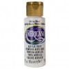
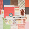
I cut some layers of paper with scissors. I like the slightly imperfect look of this style. It seems like more and more designers are using scissors to cut layers. For this layout I used a sweet photo of my son playing at the beach last year. I love the contrast that this picture presents... the vastness of the ocean and how tiny Surya is in front of it. For this layout I mainly used elements from the Bluegrass kit from Studio Calico. After I put all my layers on the base cardstock, I felt that some thing was missing. I then added white acrylic paint to soften the whole look and to transition the layers to the base.
Here are a few close ups:
I love this cloth badge that came with the kit. It was fun to use on this layout.


No comments :
Post a Comment