Tuesday, March 18, 2014

Using complementary colors on a layout

Using complementary colors to create a layout was one of the first lessons we had in the Color Studio class at Studio Calico. The examples provided in this class as usual were very beautiful. So when we think of complementary colors, we automatically gravitate to red and green, blue and orange and purple and yellow as the complementary colors. But if you used them literally, in their brightest hues, they could be quite jarring. So using hues of these complementary colors together can be more pleasing. The color wheel below was shared in our class message boards and I think it was so enlightening to see the color wheel with the perspective of tints, hues, tones and shades.


To make my layout with complementary colors, I selected pink and the opposite shade on the color wheel which is shade between green and blue. Here is my layout:

Here are some close ups:


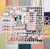
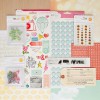
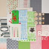
I used the office hours and coffee break scrapbook kit to make this layout. I love this cloud paper from Crate paper Style board collection.I used the Dear Lizzy stickers from Day Dreamer collection to embellish the photos. The stickers went so well with paper. I used three photos of me and my goofy baby while we were waiting for Arjun to finish his baseball practice. I just wanted to record these selfies and the context behind those. 

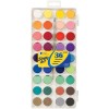
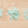
This is a very simple layout. I first stuck the photos on strip of pink patterned paper. I then stuck this on the cloud paper. I stitched along the top and bottom of the strip. I then embellished with the stickers and enamel dots.  I painted the tag pink with water color and printed my journaling on it and then attached it under the strip of photos.  I also added some twine to the tag and embellished it with enamel dots and mint star sequins from color theory. The sequins are a beautiful color. I love these. I wrote the date at the bottom and the layout was done.
Hope you enjoyed the thought process in making this layout.
Have a great day!
~Neela
SUPPLIES USED:

Sunday, March 16, 2014

Using Cool Colors on a Layout

I have been taking the Color Studio class at Studio Calico this month. We are on the fourth chapter which explains the effect of using just the cool colors or warm colors on a layout. Since I have two boys, I automatically gravitate towards the cool colors. But off late I have been making a conscious effort to use all sorts of colors even pink on the boy layouts. Why not... what do I do with all the pink product that I get in my kits?

But for this particular layout, I stuck to typical boy colors of blue and green and stuck to the cool color palette. As you can see in the color wheel below, I stuck to the blues and greens which are on the cooler side of the color wheel. You can find the pin for this color wheel here.


Here is my layout:


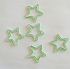
I used white as my base. I then used this super cool scalloped patterned paper from the Office Hours Studio Calico kit. I felt that it suited a rainy day layout well. I then fussy cut along the edge of the green scallops. I stuck this on a water color paper and I painted the water color paper with colors in the reverse order of the patterned paper. I started with light green and ended with light blue. I then added my photos and title. I like the cute wood veneer buttons that we got in this month's kit. I stitched them with blue embroidery floss and added them onto the layout. I had some plastic heart stickers from one of my previous kits and I added them on. I journaled along the border of the layout on the white cardstock and that completed my layout. 

The whole country seems to be freezing and having heavy snowfall but it has been warm here in California and we didn't have any rain whatsoever throughout the season. Finally in March we had a few showers and Surya was so excited to play in the rain. He loved the taste of the cool drops of rain falling on his tongue.

It was a fun layout to make! Have a great day!
~Neela
SUPPLIES USED:

Saturday, March 15, 2014

Color Studio Class @ Studio Calico

This month Studio Calico is offering the Color Studio Class. It is all about colors and how to use them in different combinations to get different final results. I am enjoying all the examples and challenges in this class. Till now we did the following topics - Complementary colors, Analogous colors, Square colors and Warm and Cool colors. It has been fun reviewing some of these concepts. At the end of each lesson we are given a combinations of colors that fit into each of these schemes. I think that is priceless. I plan on using this as a reference on my future layouts.

Our first assignment for this class, was to chose a moodboard for color inspiration and create a kit from our supplies to comply with the moodboard. I was amazed by how much there was on pinterest in terms of color combinations that are beautiful. This is the image that I selected:

You can find the pin here.

Here are the supplies I put together to go with the colors in the moodboard:


For the second challenge, we got to create a layout with the supplies we pulled together in the first challenge.When I see these colors, my heart goes back to our vacation in Cancun about 4 years ago. We got a professional photo shoot done and it was so worth it. The photo shoot captured our family and the scenery in a beautiful way. So I not only took inspiration for the colors from the moodboard but I also chose to use my photos in a grid just like the moodboard. Since I had the photos I was going to use in mind and the supplies all pulled together, it was very easy to make this layout. I didn't end up using all the supplies and also ended up using a few different supplies but having a starting point was good. Here is my layout:


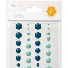
Just like the moodboard, I managed to keep the layout light and airy and added a few (very few) pops of orangish yellow. The clothes pins in the moodboard called out for the usage of the wood veneer. The ocean, the sky, the sand and the colors totally called out for these photos. I love grid designs. I am huge fan, it somehow comes to me most easily. 

So there you have it. Before I sign up for any class, I always wonder if it will be useful and if I will learn anything, but I always ending up learning, sometimes big things and sometimes little things. It is amazing see how finding an image that is pleasing to the eye can be converted to a layout. Hope you will try out something like this too. It was fun!

Have a great day!
~Neela
SUPPLIES USED:


Thursday, March 13, 2014

March 14th sketch for SOUS

Happy Friday! Can't believe that it is almost the weekend again. So I hope you have enough time to play along with us at SOUS for this challenge. You will be entered to win a prize from Creative Embellishments if you play along.

Check out the cute sketch designed by Leah. It is a very pleasing sketch. I loved it. 

And ... here is my take on it. 


I pretty much stuck true to the sketch. I just straightened up the photos and added a journaling block instead of embellishments on the right side. I am happy that I got a chance to layer. I used a whole bunch of stickers from the Party Day collection from Create Paper. It is a fun collection for birthday parties. I selected 3 photos from my son's 9th birthday. Unfortunately, I didn't have great photos from the two parties we had. I just had to select the best. I really wanted to document the event though. Arjun had a great time at both the parties. For the first party at home, all the neighboring kids got together and played minecraft for a little bit and watched the movie Planes later. For the second party Arjun invited his classmates from school and they went bowling together. He had a blast. They all got to eat cupcakes and pizza. They also played at the arcade after the bowling.

There you have it. It is a simple and fun layout. Can't wait to see what you come up with.

SUPPLIES LIST: