I have been taking the Color Studio class at Studio Calico this month. We are on the fourth chapter which explains the effect of using just the cool colors or warm colors on a layout. Since I have two boys, I automatically gravitate towards the cool colors. But off late I have been making a conscious effort to use all sorts of colors even pink on the boy layouts. Why not... what do I do with all the pink product that I get in my kits?
But for this particular layout, I stuck to typical boy colors of blue and green and stuck to the cool color palette. As you can see in the color wheel below, I stuck to the blues and greens which are on the cooler side of the color wheel. You can find the pin for this color wheel here.
But for this particular layout, I stuck to typical boy colors of blue and green and stuck to the cool color palette. As you can see in the color wheel below, I stuck to the blues and greens which are on the cooler side of the color wheel. You can find the pin for this color wheel here.
Here is my layout:
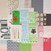
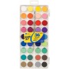
I used white as my base. I then used this super cool scalloped patterned paper from the Office Hours Studio Calico kit. I felt that it suited a rainy day layout well. I then fussy cut along the edge of the green scallops. I stuck this on a water color paper and I painted the water color paper with colors in the reverse order of the patterned paper. I started with light green and ended with light blue. I then added my photos and title. I like the cute wood veneer buttons that we got in this month's kit. I stitched them with blue embroidery floss and added them onto the layout. I had some plastic heart stickers from one of my previous kits and I added them on. I journaled along the border of the layout on the white cardstock and that completed my layout.
The whole country seems to be freezing and having heavy snowfall but it has been warm here in California and we didn't have any rain whatsoever throughout the season. Finally in March we had a few showers and Surya was so excited to play in the rain. He loved the taste of the cool drops of rain falling on his tongue.
It was a fun layout to make! Have a great day!
~Neela
SUPPLIES USED:

.jpg)


No comments :
Post a Comment